
In brief
Majorelle Blue is the intense, saturated blue associated with Jardin Majorelle in Marrakech. Its name belongs to the garden created by the French painter Jacques Majorelle, where painted architecture forms a vivid counterpoint to the surrounding plants. At home, its most useful lesson is not an exact colour formula. It is the relationship between a strong blue, the surfaces around it, and the space left for each to be seen.
Blue beside a stand of bamboo. Blue framing a doorway. Blue interrupted by a leaf and its shadow.
The colour is memorable, but it is never the whole composition. That distinction matters when we bring the idea of Majorelle Blue indoors.
A Painter’s Garden in Marrakech
Jacques Majorelle bought a palm grove on the outskirts of Marrakech in 1923. In 1931, he commissioned the architect Paul Sinoir to build an Art Deco-style artist’s studio on the property. Around it, he developed a garden that became a sustained work of observation, cultivation and arrangement.
The Musée Yves Saint Laurent Marrakech dates the creation of his bright, intense ultramarine blue to 1937. Applied to the garden’s architecture, the colour became inseparable from the place and eventually took the painter’s name.
Majorelle opened the garden to the public in 1947. Following his death in 1962, it fell into neglect. Pierre Bergé and Yves Saint Laurent acquired it in 1980, saving it from a property development project and restoring the garden.
The former studio later became a museum of Berber art. The building’s changing use is part of the garden’s history, but its blue remains the element through which many visitors first recognise it.
What Inspired Majorelle Blue?
The name is specific. The wider presence of blue in Morocco is not confined to this garden.
Lonely Planet connects Majorelle’s choice with Moroccan skies, traditional tiles and the blue veils of the Tuareg people of the southern Sahara. These references offer context, rather than a single, definitive origin for the shade.
It is more accurate to speak of a painter drawing on an existing visual world than of blue arriving in Morocco through one European artist.
Nor should Majorelle Blue become shorthand for every Moroccan blue. A glazed tile, a dyed textile and a painted wall belong to different material histories. Their colours may invite comparison without being interchangeable.
The Colour Is Only Part of the Garden
Much of the garden’s visual force lies in contrast.
Blue gives a defined edge to foliage. A painted surface holds the eye differently from a moving leaf. Light exposes one plane while another falls into shade.
This is the lesson worth carrying into an interior: look at what the colour brings into focus.
A vivid blue object beside pale plaster will read differently from the same object against dark timber. Beside warm brown leather, it forms another relationship again. The shade has not changed, but the composition has.
For a broader comparison of blue families, our guide to choosing the right blue for an interior considers lightness, saturation and undertone.
Bringing the Idea Home, Not Recreating the Garden
An interior does not need to resemble Jardin Majorelle to learn from it.
Begin with what is already present: the timber of a table, the ground colour of a rug, the upholstery of a chair. Then consider whether a saturated blue would create a useful point of contrast.
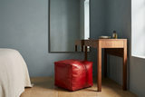
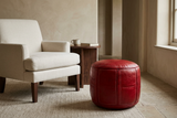
One approach is to give the colour a clearly bounded form. A leather pouf introduces blue as a volume, rather than a continuous field. Its presence can be considered in relation to the chair beside it and the floor beneath it.
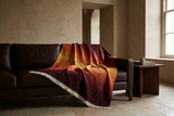
Another is to let texture interrupt the colour. On a woven surface, blue is read through the structure of the threads; on a glazed surface, reflected light becomes part of its appearance.
These are different decisions, not substitutes for the same effect.
For placement and everyday use, How to Choose Blue for Different Rooms develops the practical questions without prescribing one palette for every home.
A Blue Leather Pouf as One Possible Expression
A blue leather pouf can give saturated colour a compact, distinct place in a room. The interest lies in the meeting of colour and construction: the curve or edge of the form, the seams, and the relationship between leather and embroidery.
Its role should be considered before its colour. Where will it sit? What will surround it? Will the arrangement leave enough space for everyday movement?
Our guide to styling a Moroccan pouf explores those questions in greater detail.
A blue leather piece should not be described as an exact match to the garden simply because it recalls its intensity. Paint and dyed leather are different surfaces, and a colour name is not a guarantee of equivalence.
A Reference, Not a Formula
The lasting interest of Majorelle Blue is not that it supplies a ready-made Moroccan interior.
It offers a more attentive way to look: at colour beside foliage, at a bright surface within shade, at the edge where one material meets another.
At home, that can be enough. Not the garden reproduced, but one relationship noticed and carried forward.
Explore our Blue Home Accessories through that lens: not as matching pieces, but as individual objects with different surfaces, proportions and presences.
Sources and Further Reading
- Musée Yves Saint Laurent Marrakech — Le Jardin Majorelle: the garden’s history, the 1931 studio, the blue introduced in 1937, and the 1980 acquisition.
- Musée Yves Saint Laurent Paris — Acquisition of the Villa Oasis and the Jardin Majorelle: restoration and the former studio’s conversion into a museum of Berber art in 2011.
- Lonely Planet — Jardin Majorelle: a secondary account of the colour’s visual inspirations.