
In brief
Choose red by comparing its undertone, lightness and saturation with your existing materials. Rust and brick introduce earthier colour directions; a vivid red creates a more concentrated contrast; burgundy offers a darker, often wine-toned direction. These names are not exact colour specifications. Test the actual surface beside your furniture in daylight and evening light before deciding.
A rusty red blanket and a vivid red leather pouf do not make the same proposition. Neither does a burgundy wall. They belong to a broad colour family, but their relationships with the room can be quite different.
The right choice begins with comparison, not a ranking. Burgundy is not automatically more sophisticated than bright red, and rust is not automatically easier to use. Each needs to be seen against the materials and light already there.
At Moroccan Corridor, we look at red through the object carrying it. A weave, an embroidered panel or a curved leather surface makes a colour more particular than its name alone.
Start with the Materials That Will Stay
Identify the room's flooring, upholstery, wood and large furniture before choosing red. These surfaces form the background against which the new colour will appear.
Compare candidates with them directly. A red that looks restrained on its own may become prominent against pale upholstery. A darker red beside brown wood may create a subtler separation, or lose definition in shadow.
Decide whether you want continuity or contrast. Both are valid intentions. Choosing a shade means deciding which relationship you want to see, not finding the one supposedly correct red for your style.
Compare Red Families Rather Than Names Alone
The categories below describe palette directions, not standardised pigment formulas. Product and paint names vary. A colour called brick by one supplier may look different from another's brick.
Rust: an orange-brown direction
Rust generally describes an earthy red-orange direction, often with a brown component. Compare it with existing clay, tan and wood surfaces: related tones may create continuity, but similar colour does not guarantee a balanced composition.
On a woven surface, variations in the yarn and texture can make that relationship more layered. On a painted surface, the colour occupies a more continuous field. Choose the actual finish alongside the hue.
Brick: an earthier red
Brick commonly suggests a red tempered by earthy tones, but its lightness and orange or brown direction vary. Set it beside rust and a clearer red to see where your candidate sits.
Do not assume that the name means the surface will look like the brickwork in your home. A physical sample is more useful than a familiar label.
Bright red: a clearer colour statement
A vivid red can create a pronounced contrast with ivory, grey or darker wood. Its saturation may make a compact object visually prominent without requiring a large area.
Look at whether it leans towards orange or towards a cooler red direction. Two equally vivid reds can relate differently to the same upholstery.
Burgundy: a deeper, wine-toned direction
Burgundy usually describes a dark red, often with a purple or brown direction. It can provide a darker anchor, but the name does not specify one exact undertone.
Check it under the lighting in its intended position. A dark surface that shows clear colour and detail near a window may become less legible in a shaded corner. Depth is not a substitute for visibility.
Separate Undertone, Lightness and Saturation
These are different observations. Undertone describes the colour's direction, such as orange-leaning or purple-leaning. Lightness describes how light or dark it appears. Saturation describes its colour intensity.
A darker red is not necessarily muted. A lighter red is not necessarily less noticeable. Compare these dimensions separately rather than grouping every quieter-looking colour under “subtle”.
Place two candidates beside the same neutral surface under the same lighting. Ask which looks more orange, more purple, darker or less intense. That comparison is more useful than judging photographs made under different conditions.
Choose the Surface Alongside the Shade
Woven textiles
A textile may contain several reds or contrasting details. Look at the whole composition, including embroidery, stripes and fringe. Folding can change which tones remain visible.
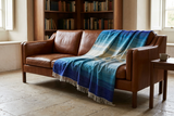
In the hero image, the Sunrise blanket brings several warm colour directions into one woven surface. Its transitions between deeper reds, orange and golden tones show why a textile can offer more than a single flat shade. Against brown leather, the colours remain distinct without requiring matching accessories. Listed as a handwoven Chefchaouen blanket with an 80% wool and 20% polyester composition, Sunrise is available in several sizes. Explore its current dimensions and care details before choosing your arrangement.
Read the individual product's fibre content and care instructions. A colour name does not establish the material or dye method.
Leather
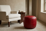
Curved leather panels, grain and stitching create highlights and shadows within one colour. A red pouf therefore needs to be assessed as a volume, not as a flat swatch.
Look at more than one product view and check the dimensions. Do not infer leather type, finish or exact colour matching from a single photograph.
Paint
For paint, compare physical samples in the intended finish and follow the supplier's sampling guidance. Check different positions on the wall if they receive different amounts of light.
Paint and accessories occupy different scales. This article focuses on choosing a colour direction; our guide to using red in a neutral home develops placement, proportion and repetition.
Test a Shortlist, Not an Endless Palette
- Choose two or three distinct directions. Compare an earthy red, a clearer red and a deeper candidate if those fit your intention.
- Use the same background. Assess each beside the upholstery, floor and wood that will remain.
- Check your actual lighting. Observe daylight and the lamps used in the evening, not only bright retail or studio lighting.
- Consider the intended area. A tiny swatch does not fully represent a wall. For an object, compare its dimensions with the available space.
- Look for the relationship you want. Choose continuity or contrast deliberately, rather than assuming a perfect match is necessary.
Online images can help narrow a choice, but they are not exact physical colour swatches. Ask about samples where available and check current product specifications.
Three Assumptions Worth Leaving Behind
“Burgundy is always more elegant.” Elegance is a judgement about the whole arrangement, not a property guaranteed by a colour name.
“Rust works with every warm neutral.” Similar undertones can connect surfaces, but lightness, saturation and texture still need comparison.
“Bright red needs a large room.” Physical dimensions and circulation matter for the object; visual prominence depends on contrast and the surrounding composition, not floor area alone.
Frequently Asked Questions
How do I choose the right red for my interior?
Compare undertone, lightness and saturation with your fixed materials, then assess the actual surface in daylight and evening light. Decide whether you want contrast or continuity.
What is the difference between rust and burgundy?
Rust generally describes an earthy orange-brown direction, while burgundy usually describes a deeper wine-toned red with purple or brown components. Names vary, so compare actual samples or objects.
Is burgundy better than bright red for home decor?
No shade is universally better. Burgundy offers a darker direction; bright red can create a clearer focal point. Suitability depends on the surface, lighting and surrounding palette.
Can I mix different reds in one room?
Yes, if their relationships and roles are considered. Compare them under the same lighting and avoid assuming that shared colour names guarantee compatibility.
Will red paint match a red leather or textile accessory?
Not necessarily. Texture, finish and reflectivity affect appearance, and identical colour names do not establish an exact match across materials.
Why does a dark red look different in the evening?
The room's lighting conditions and surrounding surfaces affect how the colour appears. Assess it under the lamps you actually use rather than relying only on daylight or a screen image.
Further Reading
For the next step, read How to Use Red in a Neutral Home Without Overwhelming the Room. It addresses the position and visual role of the piece once you have chosen a colour direction.
This is a curatorial palette guide, not a standardised colour-matching system or a report on current trend rankings.
The right red is not the winner of a comparison chart. It is the one whose relationship with your room you have taken the time to see.
Explore red through texture, shape and everyday purpose.
EXPLORE RED HOME ACCESSORIES