
In brief
To introduce red into a neutral home, begin with one useful object and give it a clear place. Assess its shade, surface, scale and contrast with the existing room before repeating the colour. A cushion, blanket, rug or leather pouf occupies a different amount of visual and physical space. Keep quieter areas around the accent, check it in daylight and evening light, and let everyday use guide the arrangement.
A neutral room does not need rescuing. Its restraint may be exactly what you value: the relationship between ivory upholstery, brown wood, a textured floor and changing light.
Introducing red need not undo that balance. It can make one part of the room more distinct, give a familiar chair a different presence or bring a textile into sharper focus. The decision is not whether to become a person who likes bold interiors. It is where this particular object belongs.
At Moroccan Corridor, we look at colour through material and form. Red on a woven surface does not behave like red on curved leather. Its role begins with the object, not a rule about how much colour everyone should own.
Read the Existing Room Before Adding Red
Neutral does not mean colourless. Cream, oatmeal, taupe, brown and grey each establish relationships with the room's wood, stone and upholstery. Identify the surfaces that will stay before choosing an accent.
Look at what already leads the composition. A large artwork, strongly patterned rug or sculptural chair may have a clear presence even without saturated colour. Red can support that arrangement rather than compete to become its new centre.
Decide what you want the addition to do. Mark a reading corner? Introduce a warmer-looking contrast beside pale upholstery? Connect with a small detail in an existing textile? A specific intention makes the choice more useful than simply wanting a “pop of colour”.
Choose One Useful Object as Your Starting Point
Starting with one piece is a way to observe, not a permanent limit. It lets you see how red works in the room before building a larger arrangement around it.
A cushion: colour within the seating
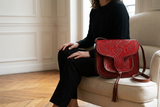
A cushion introduces red inside an existing furniture outline. Consider its size, pattern and position rather than choosing only by shade. A cushion with contrasting embroidery can be more visually active than a plain one of similar dimensions.
Check the supplied format. A styled cushion photograph may show an insert even when the product is sold as a cover only.
A blanket: an adjustable field
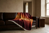
A blanket allows you to change the visible area through folding and draping. A broad fold makes colour more prominent; a compact fold reveals less. If the textile contains several tones, orientation also determines which part of the palette you see.
Leave it accessible. An elaborate arrangement that must be dismantled before anyone can sit down gives the textile a decorative role at the expense of its use.
A leather pouf: colour with volume
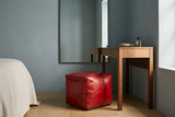
A pouf adds a separate form to the room. Even when compact, its colour can draw attention from several viewpoints. Consider the floor footprint, the visible top and the relationship with nearby seating.
Place it where it can serve its intended purpose without narrowing a walkway. Check the individual product's dimensions and filling options; do not infer the supplied format from a filled styling image.
A rug: a larger foundation
A rug introduces colour across a broader area and connects with the furniture above it. If red is already present in its pattern, that may be enough to establish the accent. Adding several separate red objects is not a requirement.
A rug is not automatically a small commitment because it can be moved. Its size, pattern and contrast can make it a major decision within the room.
Control the Contrast, Not Just the Quantity
A small vivid red object against ivory can attract more attention than a larger muted red surface beside brown wood. The amount of red matters, but it does not explain the whole effect.
Compare saturation, lightness and the surrounding materials. A bright red, a rusty red and a deep burgundy are not interchangeable accents. Colour names are only starting points, not exact specifications.
Texture adds another distinction. Woven detail can break up a colour field; curved leather panels create highlights and shadow; contrasting stitching or embroidery introduces an additional rhythm. Look at the complete object rather than imagining a flat swatch in its place.
There is no universal percentage at which red becomes excessive. Proportion guidelines such as 60/30/10 can prompt a conversation about balance, but they are not measurements that guarantee a successful interior.
Place Red Where It Has a Reason to Be
Beside a reading chair
A red pouf beside an understated chair can define a smaller setting within a larger neutral room. Leave a visible gap where needed and preserve the route past the furniture. The colour should mark a usable place, not create an obstacle.
At one end of a sofa
A cushion or blanket can make one end of the sofa more distinct while leaving most upholstery visible. Resist adding another red object merely to make the arrangement symmetrical. Test the first piece from the room's main viewpoints.
Across the lower part of a bed
A red textile can create a contained field against plain bedding. Compare its dimensions with the bed and the overhang you want. The same blanket folded into a band and spread more broadly will occupy different roles.
These are placement examples, not rules assigning a colour to each room. The best position is the one that works with the furniture, light and routine already there.
Decide Whether Red Needs an Echo
One red piece can be sufficient. A second can help connect parts of a room, but repetition is useful only when it makes the arrangement clearer.
If you add an echo, vary its scale or surface. A smaller red detail in an existing rug can connect with a pouf without becoming another equally strong focal point. Matching every accessory exactly can make the room feel arranged around a colour rather than around its use.
In an open-plan interior, look across adjoining zones before adding more. A red piece visible from several positions already participates in more than one part of the space.
Test the Balance Before Adding More
- Observe the intended position. Check daylight and the artificial light you use in the evening. Notice whether the colour or surface detail changes significantly.
- Assess more than one viewpoint. Look from the doorway, the main seat and across any adjoining zone.
- Check the physical footprint. Measure the object and preserve the space needed to move, sit and open doors.
- Adjust before multiplying. Reposition a cushion or change a blanket's fold before buying another accent.
- Keep the quieter fields. Leave enough of the existing upholstery, floor or bedding visible for the original room to remain legible.
For online purchases, compare available views and read the product specifications. A screen image is not an exact colour swatch, and material, size and care requirements vary by piece.
What to Avoid
A common source of visual competition is introducing several equally prominent red pieces at once. Another is combining a strong accent with additional patterns without deciding which element should lead.
Do not assume that darker red automatically looks more sophisticated, or that neutral neighbours always make vivid red discreet. Compare the actual arrangement.
Equally, do not turn restraint into another obligation. If a broader red field suits your room and your taste, it does not need to be reduced to a small accent. This guide offers a way to explore red within a neutral setting, not a judgement about expressive interiors.
Frequently Asked Questions
How can I add red to a neutral room without overwhelming it?
Begin with one useful piece, assess its contrast and scale, and give it a clear position. Keep quieter surfaces visible and test the arrangement before repeating the colour.
How much red is too much in one room?
There is no universal percentage. Saturation, pattern, material, placement and the surrounding palette affect visual prominence as well as the area occupied by red.
Do I need several red accessories to make the colour belong?
No. One piece can establish a clear accent. Add a smaller echo only if it helps connect the composition rather than creating another competing focal point.
Can red work in a small neutral apartment?
Yes, as a palette choice, provided the object's dimensions and placement suit the available space. Check circulation and contrast rather than assuming the room needs to avoid red.
Is burgundy always subtler than bright red?
No. Burgundy is a deeper colour direction, but its prominence depends on the background, surface and lighting. Compare actual samples or objects rather than relying on the name.
Does a red pouf or cushion arrive ready to use?
That depends on the product. Some poufs are supplied unfilled and some cushions are sold as covers without inserts. Check the current product description and options before ordering.
Editorial Note
This is a practical and curatorial guide to composition, not a claim about the psychological effects of red or a report on current colour trends. Material, origin and care claims should be checked on each individual product.
A neutral home can remain neutral in spirit while making room for red. Start with the object, give it a purpose, and let the room show you whether it needs anything more.
Explore red accents through their material, shape and everyday purpose.
EXPLORE RED HOME ACCESSORIES