
In brief
There is no single best blue for a bedroom, living room or home office. Start with the room's light, existing materials and everyday use, then decide how much space blue should occupy. A painted wall, a blanket, a cushion and a leather pouf introduce colour at different scales. Choose the role first, then the shade.
A room does not need a prescribed colour to fulfil its purpose. Bedrooms do not have to be pale blue, offices do not require navy, and a small entrance does not automatically need a light palette.
The useful question is more specific: where will blue sit, what will surround it, and how will the space be used?
At Moroccan Corridor, we approach a room through the objects people live with. Colour matters, but so do the chair you want to sit in, the blanket you reach for and the space you need to move through.
Living Room: Decide What Leads the Composition
A living room brings several surfaces into view at once: seating, floor, walls, tables and textiles. Before adding blue, identify the element that already attracts attention.
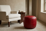
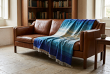
If the room has a strongly patterned rug or a prominent artwork, blue can take a supporting role through a quieter textile. If the existing arrangement is restrained, a blue pouf or a more expressive blanket can become the colour focal point.
A cushion changes part of the seating composition. A blanket occupies a larger, adjustable field. A pouf introduces a separate volume on the floor. These choices are not interchangeable, even when their colour descriptions are similar.
Keep the arrangement usable
A pouf beside a chair should leave a clear route; a blanket should be easy to lift and use; cushions should not occupy all the available seating. Measure the object and the space it will occupy, including the room needed to sit down and move past it.
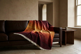
For a product-specific example, our Blue Sky blanket styling guide explores how folds and placement change the amount of colour visible on a sofa.
Bedroom: Consider the View and the Daily Routine
In a bedroom, decide whether blue belongs mainly to the architecture or to the bedding composition.
A blue wall remains visible when the bed is unmade or the textiles change. A blue blanket at the foot of the bed provides a more contained field that can be folded, removed or repositioned. Neither is inherently the better solution.
Look at the room from the doorway and from the bed. An accent that is clear on arrival may sit outside the view you experience most often.
Ocean: one textile, a clear colour role
In the hero image, the Ocean blanket gives blue a generous but defined place across the lower part of the bed. Its visible shifts between deeper blue and turquoise bring movement to the woven surface, while ivory bedding and warm wood provide a quieter setting. The room does not need matching blue cushions to make the textile belong.
Ocean is listed as a handwoven blanket from Chefchaouen, with an 80% wool and 20% polyester composition and a blue, turquoise and purple palette. The approximate sizes are 130 × 200 cm, 160 × 250 cm and 180 × 250 cm. Choose by your mattress width and intended coverage, not by the photograph alone. Explore Ocean's available sizes and care details.
Check coverage, not just colour
Check the textile's actual dimensions against the mattress and the overhang you want. A broadly folded blanket and a full bed covering require different amounts of fabric. For cushion covers, check whether inserts are included rather than assuming that a styled photograph shows the supplied format.
Assess blue under the lamps you use in the evening as well as in daylight. Do not choose it on the assumption that the colour will improve sleep. Comfort, lighting and the room's practical arrangement deserve their own attention.
Home Office: Protect the Working Space
In a home office, colour should fit around the working arrangement rather than compensate for an inconvenient one.
Consider where blue will appear during the day: behind the screen, beside the desk, in a reading corner or within the background of video calls.
A blue textile on a secondary chair can connect a workspace with the rest of the home. A larger painted field makes a different commitment. Decide which role suits the room before selecting a shade.
Leave room for movement
Avoid adding a pouf simply because its colour works. Check whether it leaves enough space for the desk chair to move and whether it has a genuine use outside that movement zone.
Blue is not a guarantee of concentration or creativity. Choose it because it belongs in the composition and works under the lighting you actually use.
Entrance: Give Blue a Clear, Practical Place
An entrance is often seen briefly, but it also handles repeated movement, doors and daily belongings.
Start with the available footprint. A blue object should not obstruct a door swing or narrow the route through the space.
Where seating already exists, a cushion may introduce colour without adding another floor-standing object. In a larger entrance, a pouf can provide a more substantial presence, provided its dimensions and intended use suit the setting.
Check the light rather than assuming a deep blue will always be too dark. Its surface may remain readable beside a window but lose detail in another position.
Keep care requirements part of the decision. An object close to an exterior doorway may face different conditions from one in a quiet bedroom. Follow the specific product's instructions rather than treating every blue textile or leather finish alike.
Open-Plan Spaces: Connect Without Repeating Everything
In an open-plan interior, several arrangements can be visible together. Blue can help connect them, but every zone does not need the same shade or the same object.
Look across the space from its main viewpoints. Decide where the strongest blue belongs and where a smaller echo is useful.
A multitone textile can provide continuity without demanding exact matches. Alternatively, materials such as wood, linen or leather can connect the zones while blue remains concentrated in one area.
If the open-plan room already contains several patterns and colours, another repeated blue element may add competition rather than coherence. Remove or reposition an existing accent before deciding that a new one is needed.
Frequently Asked Questions
What is the best blue for a living room?
There is no universal best shade. Compare the room's light, fixed materials and existing focal points, then decide whether blue should lead the composition or support it.
Should a bedroom always use pale blue?
No. Pale, muted and deeper blues can serve different visual roles. Assess the actual surface under daylight and evening lighting rather than choosing by room type alone.
Can I use a blue pouf in a small room?
Potentially, if its dimensions fit the available space and it has a useful role. Measure the intended position and check circulation before deciding.
How can I introduce blue in a home office?
Choose a position that works with the desk, chair movement and lighting. A textile, wall or secondary seating area can each introduce blue at a different scale.
Do blue accents need to repeat in every open-plan zone?
No. A clear focal point and a smaller echo may be enough. Materials and related tones can also connect the zones without identical accessories.
What should I check before buying a blue textile for a bedroom?
Check its dimensions, supplied format, composition and care instructions. Compare the size with the bed and the amount of coverage or overhang you want.
Further Reading
For the associations and atmosphere of blue, read What Does Blue Mean in Interior Design? Colour, Context and Atmosphere.
For comparing shades and undertones, read Which Blue Is Right for Your Interior? From Soft Sky to Deep Indigo.
For one textile in practice, explore the Blue Sky blanket styling guide.
A colour does not belong in a room because a rule assigns it there. It belongs when its material, scale and position work with the way you live.