
In brief
In interior design, blue is often associated with calm, openness and depth. These are associations, not guaranteed effects. A pale blue wall, a saturated leather pouf and an indigo textile create different visual experiences. The atmosphere depends on the shade, the light, the material, the area it occupies and what surrounds it.
Blue is not one atmosphere. It can be a pale field that lets a room breathe, a vivid accent that draws the eye, or a deep textile that gives a quiet corner more weight. Calling all three “calming” misses what makes them different.
The useful question is not simply what blue means. It is what this particular blue does, on this particular surface, in the room you live in.
At Moroccan Corridor, we approach colour through objects and materials. A woven blanket, an embroidered cushion cover and a leather pouf can share a colour family without behaving like matching pieces. Their texture, scale and position shape the experience as much as their hue.
What Blue Means: Association Is Not an Effect
Sky and water provide familiar visual references for blue. In a room, a light blue may suggest openness; a deeper blue may be read as enveloping; a highly saturated blue can become a strong focal point. These descriptions offer ways to discuss a composition, not a universal dictionary of emotion.
Personal memories and cultural context matter. One person may connect blue with a coastal landscape, another with painted architecture, clothing or a family home. The same colour does not carry the same story for everyone.
What colour psychology can—and cannot—tell you here
Popular decorating advice often turns an association into a promise: blue reduces stress, improves sleep or makes a room peaceful. Those claims require evidence about specific conditions and outcomes. A paint colour or accessory should not be presented as a treatment or a guarantee of wellbeing.
This article uses “calm”, “depth” and “energy” as descriptions of a proposed visual atmosphere. They are not claims about a measured psychological response. An attractive room can support the way you want to live without its colour being responsible for everything you feel in it.
Different Blues Have Different Presences
The word blue covers a broad range. Lightness, saturation and the direction of the hue all affect its relationship with a room. Colour names are also imprecise: “sky”, “ocean” and “indigo” are useful starting points, not interchangeable specifications.
Pale blue: a lighter visual field
A pale blue beside ivory or a light neutral can produce a restrained composition. Against dark wood, the contrast becomes more distinct. When used across a large area, it participates in the room's background; on a small cushion, it may be only a gentle interruption.
Saturated blue: a clear point of attention
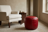
A vivid blue can draw attention even when its footprint is small. A leather pouf or a concentrated embroidered panel may therefore carry more visual weight than its physical size suggests. Give it quieter neighbours if you want its colour and detail to remain legible.
Deep blue: weight and layering
A deep blue textile can anchor a light arrangement or sit within a darker palette. Its pattern and surface still matter: a plain dark field and a dark field crossed by pale embroidery do not read in the same way. “Dark blue” is only the beginning of the description.
These are compositional possibilities, not prescriptions for particular rooms. Choosing a shade and applying it to a bedroom or living room deserve their own practical discussions; here, the aim is to understand why blue's meaning changes.
Material Changes the Way Blue Is Seen
A paint sample cannot fully predict the appearance of a woven cushion, just as a textile photograph cannot stand in for a leather finish. Texture breaks up a colour field, while relief and reflectivity create highlights and shadows.
On woven textiles
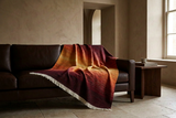
A woven surface brings small variations in light and texture into the colour. Stripes, embroidery and fringe add another rhythm. In a multi-toned blanket, the fold changes which blues you see and how much area they occupy.
The Blue Sky blanket styling article explores that question through one actual textile. It shows how revealing several shades or folding them into a narrower band changes the composition. Its product specifications, rather than a general association with a region, establish its fibre content and care requirements.
On leather
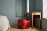
On a leather object, curved panels, stitching and surface relief can give one colour several visible values. A highlight on the upper curve of a pouf and a shadow beneath it belong to the same object. This is why a blue leather accent can have depth without needing several separate colours.
Inspect photographs that show the shape as well as the surface. Do not infer an exact dye process, leather type or colour standard from appearance alone.
Across different surfaces
A blue wall establishes a field around the furniture. A blue blanket or cushion remains an object within that field. A pouf also occupies floor space and introduces volume. The distinction is not that one choice is inherently better, cheaper or more authentic: they operate at different scales.
Light and Surroundings Change the Reading
Evaluate blue where it will actually be used. Window light, artificial lighting and neighbouring surfaces can change how a colour appears. A product photograph or screen is not an exact physical colour swatch.
Look at the intended position in daylight and again under your evening lighting. Notice whether the blue remains distinct, loses detail in shadow or becomes more prominent against its surroundings. For paint, use a physical sample large enough to assess in place rather than relying on a small digital image.
Warm wood, brown leather, ivory and clay tones offer possible contrasts. These pairings do not change blue's physical temperature or guarantee a warmer emotional response; they change the balance of the composition. Equally, blue with grey or white is not automatically cold. Texture, light and proportion can give that palette considerable variety.
Blue in a Moroccan Context: Be Specific About Place
Chefchaouen offers an architectural reference for exploring blue, but it should not become a single explanation for every blue Moroccan object. A city's painted surfaces, its textile traditions and the colour of an individual product are related subjects, not proof of an identical origin or meaning.
Our Chefchaouen city guide discusses the city's setting and the debated accounts of its blue walls. The Chefchaouen textiles article provides a separate introduction to the weaving tradition. Neither needs to be reproduced inside a colour-styling guide.
The same care applies to names such as Majorelle blue. A cultural reference is not an exact colour specification for every object described as cobalt or vivid blue. Check the individual piece rather than assuming its shade, history or symbolism from a familiar name.
Moroccan Corridor's role is to make these distinctions useful: colour opens the conversation; the object's documented origin, material and construction give it substance.
A Practical Method: Observe Before You Interpret
Before deciding that a room needs “calming blue” or “energising blue”, examine the actual composition.
- Name what you can see. Is the blue pale, deep, muted or saturated? Does the surface include another colour, visible relief or a pattern?
- Identify its role. Is it a background, a focal point or a small connecting detail? A large area and a small accent ask different things of the surrounding room.
- Check it in place. Observe the intended location by day and under your evening lighting. Assess physical samples when available.
- Look at the neighbours. Compare it with existing upholstery, floor, wood and metal finishes. Decide whether you want contrast or continuity.
- Keep function in the decision. A blanket should remain usable, a cushion should suit the seating, and a pouf should leave circulation clear. Colour does not replace dimensions or product specifications.
Only then describe the atmosphere you want. “A pale textile against dark wood” is a more actionable starting point than “blue makes people relaxed”.
Frequently Asked Questions
What does blue represent in interior design?
Blue is often associated with calm, openness and depth. Its meaning is not fixed: shade, material, light, scale and personal or cultural context change how it is perceived.
Does blue automatically make a room calming?
No. A colour association is not a guaranteed psychological effect. A vivid blue focal point and a pale blue background can create very different visual compositions.
Can a blue interior feel warm?
Yes, as a description of its atmosphere. Warm-toned wood, brown leather, ivory and tactile surfaces can balance blue. The result depends on the whole composition, not on a rule about one colour.
Why does the same blue look different on leather and textiles?
Texture, relief and reflectivity affect how light meets the surface. A woven textile and a curved leather object can therefore show a colour differently, even when their colour descriptions are similar.
Does blue have one meaning across Moroccan design?
No. Meanings and uses should be discussed in their specific local and material contexts. Chefchaouen's painted architecture does not establish the origin or symbolism of every blue Moroccan object.
Do all the blue pieces in a room need to match?
No. You can connect objects through texture, proportion or a related palette instead. Give each piece a clear role and compare the arrangement in the room's actual light.
Further Reading
This is a curatorial and practical guide to visual composition, not a clinical review of colour psychology. For the regional context and a product-specific application, read the Chefchaouen city guide, our introduction to Chefchaouen textiles and the Blue Sky blanket styling guide.
Blue does not have to tell the same story in every room. Look at the light, move closer to the material, and let the object make the colour particular.
Explore blue through Moroccan textiles, leather and the objects you live with.
EXPLORE THE BLUE EDIT