


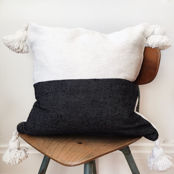


The Balance of Contrast
Two broad fields meet across the square. White and black share the surface without a repeated stripe or an added motif. The dividing line gives Blanco Y Negro its clarity; the woven cotton keeps that clarity from feeling flat.
In the darker field, fine lighter flecks bring the threads into view. Across the paler half, small changes in the surface catch the light more quietly. The same composition holds two different ways of seeing the weave.
Handwoven in Morocco, the cover is finished with four white cotton pom poms, one at each corner. They continue the pale tone beyond the outline, becoming especially distinct beside the black field. Cover and pom poms are 100% cotton.
Collector’s Note
We chose Blanco Y Negro for the structure it brings to an arrangement. It can connect pale upholstery with darker furniture, or provide a clear interval among smaller patterns. Its strength is in proportion rather than ornament: two tones, one dividing line, and four white details that soften the square.
A clear division. A shared weave. Contrast, held in balance.