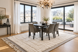

In brief: You can build a calmer-feeling bedroom palette without repainting by carrying colour through a wool rug, a blanket or throw, and a few cushion covers. Use the familiar 60/30/10 guideline as a flexible starting point, and consider light, contrast, saturation and texture alongside colour.
Colour does more than decorate a bedroom. It can influence how a room feels, especially when tones, light and materials work together. Most bedroom-colour advice begins with paint swatches, but textiles can carry just as much of the palette and are easier to change.
You do not have to put the bedroom colour on the walls. A rug, blanket and cushion covers can bring in a considered palette without committing to a new paint colour.
Why Soft Blues and Muted Greens Can Feel Restful
Soft blues and muted greens are often associated with calm, restful environments. In a bedroom, their effect depends not only on the colour itself but also on light, contrast, saturation and the materials carrying it.
Wool has a different visual depth from a painted wall: its fibres, texture and tonal variation interact with the light, so even a muted colour can feel less flat. A rug can establish a quiet base, while a blanket or throw introduces a related shade closer to the bed.
Browse Moroccan rugs for a ground colour, then use the actual tones in the piece you choose to guide the rest of the room.
Use Warm Earth Tones for a Quieter Visual Character
Warm, muted earth tones — cocoa, taupe and sand — can give a bedroom a grounded, quieter visual character. They work well as a base or as a small accent against cream, soft blue or muted green.
A wool rug or blanket in a warm neutral can bring this palette into the room without relying on painted walls. The material adds texture, while the muted colour helps keep the overall palette quiet and understated.
For a sharper, more graphic bedroom palette, explore our guide to black-and-white stripes in the bedroom.
Apply the 60/30/10 Guideline Through Textiles
The familiar 60/30/10 design guideline can also be applied through textiles rather than paint. Treat it as a flexible way to distribute colour, not a scientific rule or a measurement of the room’s floor area:
- 60% — the dominant textile tone. Start with a larger rug where appropriate, using its main colour as the visual foundation. If a rug is not the right anchor for your room, let another prominent textile carry the dominant tone.
- 30% — the blanket or throw. Choose a second, related tone for the bed. A Moroccan blanket or throw can introduce a sage, grey-blue or warm neutral, depending on the palette you are building.
- 10% — cushions and smaller accents. Use a couple of cushion covers in a deeper tone for the accent colour. A hand-pierced lantern can add warm, low evening light without becoming another dominant colour in the palette.
If a colour does not feel right in your room, you can swap a rug, throw or cushion cover rather than repainting the walls.
How Wool Texture Changes the Way Colour Reads
The way a colour is perceived also depends on the surface carrying it. A matte, textured textile can soften reflections and make a muted palette feel quieter than a glossy or highly saturated surface.
Wool’s fibres and tonal variation give colour a different visual depth from a smooth painted wall. That difference comes from the way wool fibres, texture and tonal variation interact with light.
Dye methods vary by piece. Where a rug or blanket is specifically described as naturally dyed, check its product details for the stated process; do not assume that every Moroccan wool textile uses plant- or mineral-based dyes.
Small Swaps, Less Commitment
You do not need to repaint a bedroom to experiment with a calmer palette. Start with a wool rug for the dominant tone, add a blanket or throw in a related colour, then use cushions for a smaller accent. Adjust the lighting separately, rather than counting it as part of the colour percentage.
There is no single colour formula for a restful bedroom. The aim is a bedroom palette that feels restful to you, shaped by colour, light and material, and easy to change when you want a different mood.
Frequently Asked Questions
How can I create a calmer bedroom palette without repainting? Use textiles to carry the colour: let a larger rug, where appropriate, establish the dominant tone, add a blanket or throw in a related colour, and use cushions for a smaller accent. Adjust lighting separately from the colour proportions.
Which colours can make a bedroom feel more restful? Soft blues and muted greens are often associated with calm, restful environments. Warm, muted earth tones can give the room a quieter visual character. How colours feel also depends on light, contrast, saturation and the materials carrying them.
How can I use the 60/30/10 guideline with bedroom textiles? Treat it as a flexible design guideline: use a dominant textile tone, a related secondary tone in a blanket or throw, and cushions or smaller accents for a deeper colour. A lantern can add warm evening light without counting as another colour in the proportions.
Does the rug have to be the dominant colour? No. The dominant tone can come from a prominent textile. Start with a larger rug where it suits the room, and use its main colour as the visual foundation; otherwise, let another textile carry that role.
Are all Moroccan wool textiles naturally dyed? No. Dye methods vary by piece. Check the individual product details for the stated process rather than assuming every Moroccan wool textile is naturally dyed.
Colour without commitment
Build your bedroom palette one textile at a time.
Start with a rug, then layer in a blanket or throw and a few cushion-cover accents. Choose tones that work in your own light and are easy to change.
Pair with