
In brief
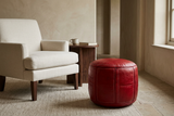
Red can work with ivory, cream, brown, deep blue, muted green and earth tones, but no pairing succeeds by colour names alone. Compare the actual shades, surfaces and lighting, then give each element a different role. A red leather pouf against linen, a burgundy textile beside walnut and a patterned rug containing several colours create different relationships.
The question “What goes with red?” often invites a list. Yet a list does not explain why a combination works in one room and feels unresolved in another.
Ivory can make red more distinct. Brown can connect it with the furniture. Deep blue can introduce another strong colour direction. None of these choices tells you how much of each to use or which material should carry it.
At Moroccan Corridor, we begin with surfaces and objects. The palette is not only red and cream. It is red leather beside cream linen, or a woven red field beside pale stone. That distinction gives colour a place to belong.
Start with the Red You Actually Have
A bright orange-leaning red, an earthy brick and a deep burgundy will not relate identically to the same background. Before selecting a partner colour, inspect the red itself.
Our guide to choosing red from rust to burgundy explains undertone, lightness and saturation. Here, the next step is to compare that choice with other surfaces.
If red belongs to a patterned textile, include its other tones in the decision. Embroidery, borders and fringe can be part of the palette even when the product is described primarily as red.
Red with Ivory and Cream: Clear Contrast
A light background gives red a defined presence. Ivory upholstery, cream bedding or pale stone can leave its silhouette and surface detail easy to read.
This pairing is useful when you want the red object to lead. It does not make vivid red discreet; it can make it more noticeable. Keep that contrast deliberate.
Let texture distinguish the lighter surfaces
Several pale materials need not be identical. Linen, a textured rug and stone can provide variation without introducing another dominant colour. Compare their actual tones rather than assuming everything labelled cream matches.
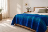
A red pouf beside an ivory chair and a red textile across cream bedding are different applications of the same contrast. Choose according to the object and the available space, not a fixed decorating formula.
Red with Brown and Wood: Material Continuity
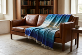
Brown can connect red with furniture already in the room: a walnut table, a leather sofa or a wood bed frame. The relationship depends on the brown as well as the red.
A dark wood surface and a lighter caramel leather surface will not support the same accent in the same way. Compare both colour and lightness. If a deep red and a dark brown merge visually, a lighter neighbouring surface may help distinguish them.
Use the textile as a bridge
A multitone blanket can bring several warm directions together without requiring separate accessories for every stripe. The Sunrise blanket is one catalogue example: its graduated warm palette offers a way to explore red alongside orange and golden tones. Inspect its actual product photographs and specifications rather than treating the textile as an exact paint chart.
The point is not that brown makes red expensive-looking. It is that material and colour can connect the new object with what is already there.
Red with Deep Blue: Two Colours with Distinct Roles
Red and deep blue can make an expressive pairing. To keep the arrangement readable, decide which occupies the larger field and which acts as the accent.
A navy sofa with one red textile makes a different statement from a red wall with several blue accessories. Neither requires equal amounts of the two colours.
Give the contrast a quieter neighbour
Ivory, brown wood or a restrained neutral textile can provide space between the stronger colours. That is a compositional option, not a mandatory third-colour rule.
Check darker blues and reds under evening light. Detail that is visible by day may become harder to distinguish in a shadowed position. For exploring blue objects separately, see the Blue Edit.
Red with Muted Green: A Considered Counterpoint
Red and green are often discussed as a contrasting pair, but “green” covers many directions. Olive, sage and a vivid emerald do not produce the same arrangement.
A muted green surface can provide a different counterpoint from another saturated colour. Compare it directly with the chosen red; do not assume muted means neutral.
If the combination feels too themed for your taste, reduce repetition and vary the materials. A red object, one subdued green element and quieter surrounding surfaces can read differently from numerous alternating red and green accessories.
This is not a formula for avoiding a seasonal association. The particular shades, proportions and context determine the reading.
Red with Earth Tones: Related Does Not Mean Identical
Clay, ochre, sand and terracotta offer possible neighbours for red. Earthier reds may connect with them through related colour directions, while a clearer red can establish a stronger distinction.
Look for enough difference in lightness or texture to keep each surface visible. Several closely related tones can produce depth, but they can also merge if every field has the same weight.
A textile containing red and ochre already creates one relationship. Adding an ochre wall is another decision, not a necessary continuation of the object.
What About Black, White and Grey?
Black can define an edge or introduce a darker anchor, while a strong white-red contrast can make the composition graphic. Grey needs to be assessed in its actual shade: a cool-looking grey and a warmer grey will sit differently beside red.
These colours are not automatic shortcuts to sophistication. The finish, pattern and amount of each still matter. A small black detail in a rug is not equivalent to a large black piece of furniture.
Test the Palette Together, Not One Swatch at a Time
- Gather the fixed surfaces. Compare the proposed pairing with upholstery, flooring and wood that will remain.
- Use the same lighting. Judge actual samples or objects together in daylight and under your evening lamps.
- Choose which element leads. Decide whether red or its partner is the main field, accent or smaller detail.
- Include pattern and finish. A contrasting border or glossy highlight belongs to the visual composition too.
- Check the intended scale. A small sample cannot fully represent a large wall, and a photograph does not establish an object's fit.
Online photographs are useful for comparison but are not exact physical colour swatches. Ask about samples where offered and read the individual product's dimensions, composition and care instructions.
For placement and repetition once your palette is chosen, read How to Use Red in a Neutral Home Without Overwhelming the Room.
Frequently Asked Questions
What neutral colours go with red?
Ivory, cream, brown, grey and sand are possible partners. Compare their actual shades, finishes and lightness with the chosen red rather than relying on colour names alone.
Can red and blue work together in an interior?
Yes. Give them distinct roles and assess their contrast in the room's light. A quieter neighbouring material can support the pairing without requiring equal amounts of both colours.
Can I pair red with green without creating a seasonal look?
Potentially. The particular shades, materials, proportions and repetition matter. Muted greens and restrained repetition create a different composition from numerous vivid red and green accents.
Does red need matching accessories?
No. Materials, related tones or existing patterned details can connect the composition without repeating red in several separate objects.
Do I need exactly three colours in a room?
No. A three-colour palette can be a planning tool, but it is not a requirement. Consider the role and visual weight of each surface rather than counting colour names.
Should I match paint to the red in a textile?
Exact matching is optional and cannot be established by a screen image or colour name. Compare physical samples where available, accounting for differences in material, texture and lighting.
Further Reading
For selecting a red direction, read How to Choose Red for Your Interior: From Rust to Burgundy. For integrating the chosen object, explore our guide to red in a neutral home.
This article presents curatorial palette options, not universal colour rules or guarantees about mood, luxury or wellbeing.
The best companion to red is not always another colour. Sometimes it is a material that gives the colour a reason to be there.
Explore red through its relationships with texture, shape and everyday use.
EXPLORE RED HOME ACCESSORIES